About the project
This was a school project for Kjær Gartneri who wanted to renew their website to promote the organic tomatoes they grow. A successful design could give them a niche in the market as an exclusive and high end product.

Web design for Kjær Gartneri
This was a school project for Kjær Gartneri who wanted to renew their website to promote the organic tomatoes they grow. A successful design could give them a niche in the market as an exclusive and high end product.
It was important for the customer for the design to be warm and vivid, reflecting life, sunlight, nature and working with soil. It was a challenge, though, to merge this thinking into a design that was more refined and would attract high end users without seeming cold and impersonal.
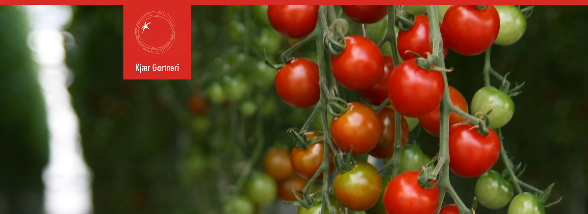
The solution we developed was a stylish, but warm design, with the colors of tomatoes and soil. A large part of the design was to use lots of pictures to convey Kjær gartneri’s message of tender, organic tomatoes that taste absolutely delicious.


