About the project
This was a school project where we would learn about design research, concept
development, interaction between hardware and software, product design and last,
but not least, user testing. We were to develop, design and prototype a product
or service that solves a defined problem. We landed on the idea of a service
that would make it easier to be more social, meet new people if you’re new in
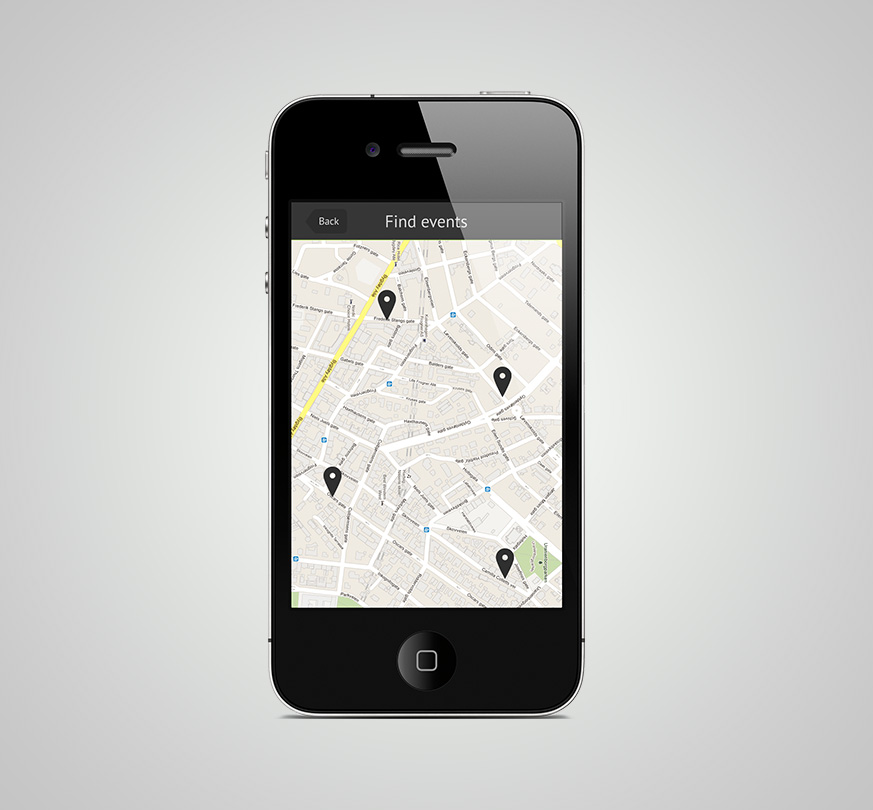
town, find events around you, such as theater performances, concerts, courses
for hobbies, or something as simple as having your friends over for coffee.
Challenges
The challenge was whether we could create a service that makes it easier to meet
people through activities and make new friends, but that did not focus on
dating. It was therefore important to focus on the activities. It should be a
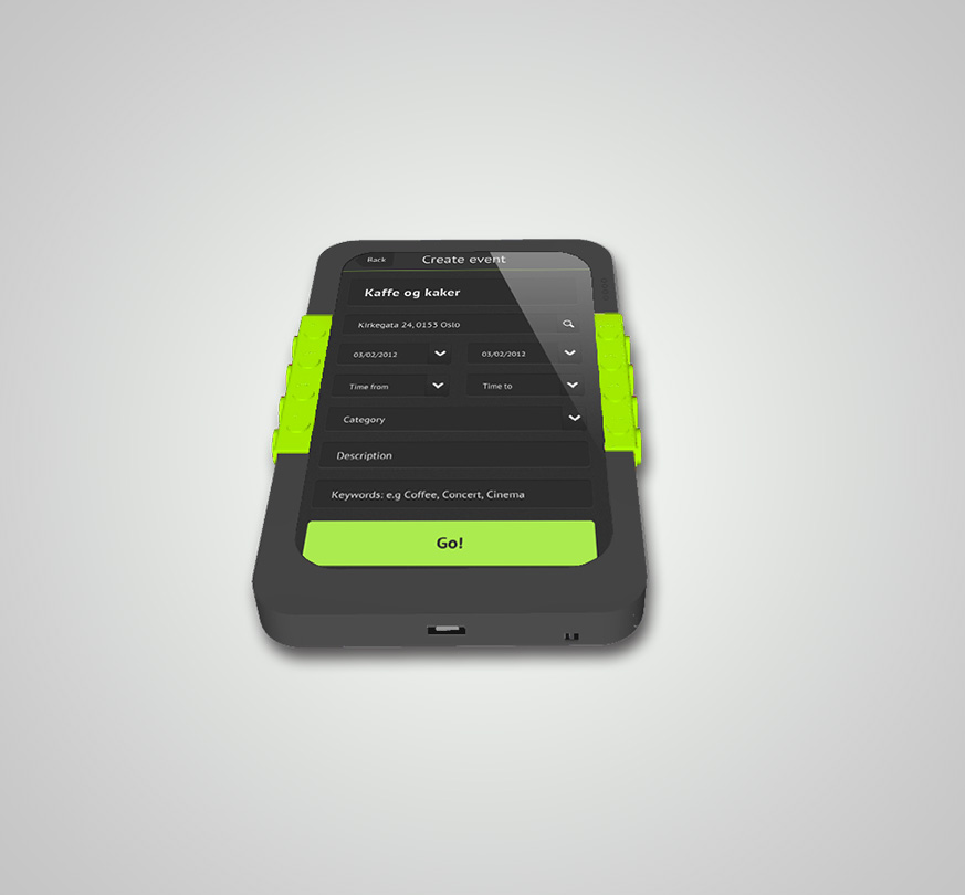
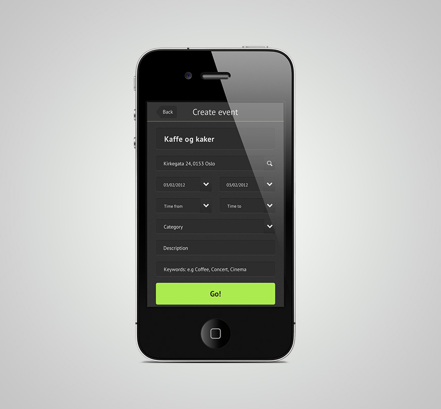
low threshold for identifying activities, sign up and possibly create your own
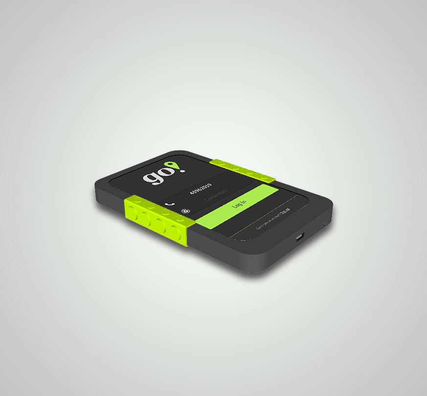
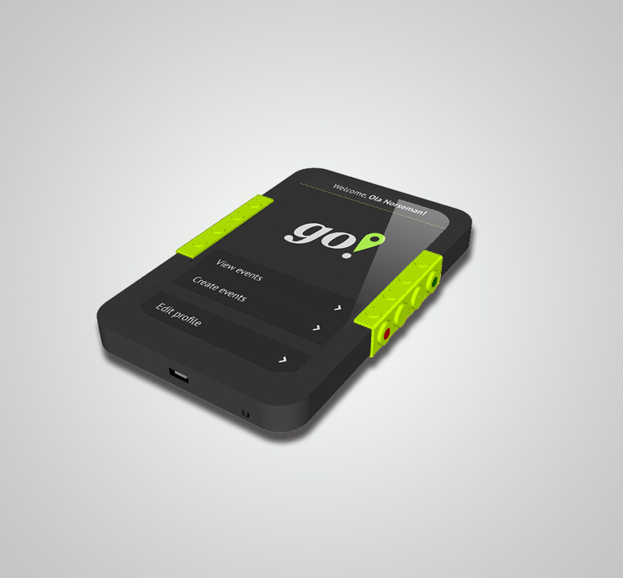
activities for friends and family. Hardware that would complement the software
and make it easier to use was also to be designed.
Solution
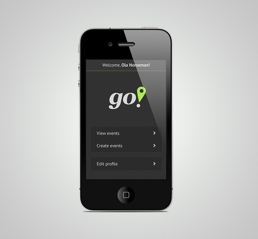
The design is stylish with few colors to keep the function of the app in focus.
This also goes back to the hardware where we made a device that will be good
to hold, with a rubber surface so that it does not slip and a special non-slip
surface where grip should be. The device is touch based but also has its own
buttons easily accessible to easily accept or reject activity invitations. It is
also designed to be shock and water resistant so it won’t be damaged by swiftly
whipping it out of your pocket, and you need not worry about it hitting the
ground during an an activity like geocaching.


